


Line Charts - General Aptitude
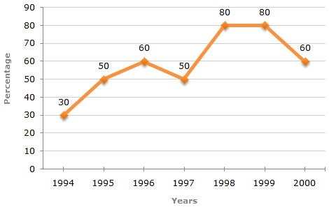
The following line graph gives the percentage of the number of candidates who qualified an examination out of the total number of candidates who appeared for the examination over a period of seven years from 1994 to 2000.
Percentage of Candidates Qualified to Appeared in an Examination Over the Years
A
1995 and 1997
B 1995 and 2000
C
1998 and 1999
D Data inadequate
ANS:D - Data inadequate The graph gives the data for the percentage of candidates qualified to appeared and unless the absolute values of number of candidates qualified or candidates appeared is know we cannot compare the absolute values for any two years. Hence, the data is inadequate to solve this question. Share : |